Interview: The Unique Challenges of UX Design for Patient-Facing Apps
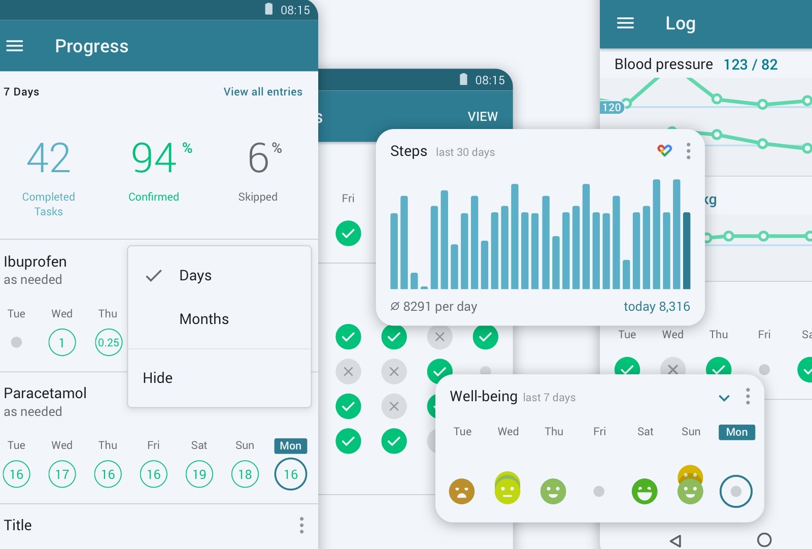
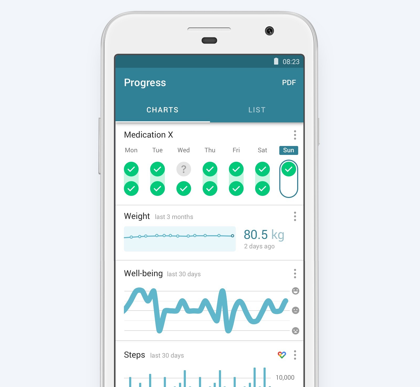
Usability and accessibility are a couple of the key considerations for MyTherapy’s UX designers. Getting them right has helped grow the app into the world’s fastest-growing disease management app; getting them wrong, though, could have serious safety implications

Designing software and apps intended to support people in taking their medications and to help them better manage their disease(s) carries unique and important challenges. Not only does such an app need to be easy-to-use for people of all demographics, but it must do so while offering functionality for countless use-cases.
Crucially, the design of the app must be as clear as possible. Any room for confusion can have serious consequences when it comes to users’ medication intake and, subsequently, their health. For Martin Thiemann, Head of Design at smartpatient, these are the challenges he and the design team face in the development of MyTherapy. In this interview, Martin gives us insight into how he approaches the challenges of UX design for patient-facing software and the design ideology shared within the team.
Martin, healthcare UX design carries unique challenges. What are some of the most important considerations when designing patient-facing solutions?
Our product must work for almost anyone. Trying to identify a typical patient that we focus on and optimize for is impossible. So, our solution needs to be inclusive, privacy-focused, accessible, and safe in the first place. Let’s look at two example patients. First, a 35-year-old woman living with multiple sclerosis (MS), administering multiple injections a week, and medications to treat symptoms, living an active life. Secondly, a 60-year-old man receiving treatment for a set of widespread chronic diseases like diabetes type 2 and hypertension. Their day-to-day lives could not be more different.
We aim to address them all with some fundamental requirements like safety and accessibility. On top of that, we offer features that work for only a certain group of users that we develop together with patients and health care professionals to meet their expectations on point.
Another important topic is to leave the diagnostic and treatment responsibility to health care professionals only. We see our product as an enabler to drive adherence and self-management, not as a replacement for a doctor.
How does this change the way in which you approach design tasks? Can you provide any example?
One example is that we are in constant dialog with real patients. With our large userbase, we are constantly approached by patients who want to help us understand their day-to-day life and treatment and struggles better. So, when working on new functionality or improving an existing one, we use this mighty opportunity and get in touch with them, having calls and showing first ideas in the form of mock-ups. These discussions have led to many unexpected changes.
Another example is “default” values. It is a common best practice in the UX industry to use smart defaults wherever you can to make it really easy for users to set something up or to walk through a flow. In our case, we need to be really careful about this. Let’s say we add an input field for a medication dose. Is a default value of “100 IUs” perceived as a suggestion from a medical perspective? We cannot accept that our app is overruling what the HCP has prescribed. That is why we come up with alternative interaction ideas.
UX designers often have to find a balance between aesthetics and functionality. How does designing for healthcare affect the way this balance swings?
Our approach is clearly to achieve timeless UI designs with little decoration as possible. We focus on delightful micro-interactions that help the patient to achieve a task faster and with more consciousness.
In fact, I believe apps using the latest technology to create fast, responsive, and reliable user interactions are perceived as “modern” rather than products overloaded with visual artifacts.
‘Gamification’ is a popular way that designers and developers aim to keep patients engaged over time. To what extent have you considered adopting this approach and what are your thoughts on whether gamification is appropriate for apps designed for patients living with chronic diseases?
Gamification is a double-edged sword. We have included gamification elements in parts of the app, especially when it comes to long-term adherence goals and this is definitely appreciated by users. It is often about creating little positive sparks in routines that are usually considered boring, annoying, or even painful.
Gamification ideas, when designed and executed poorly, have the risk to fire back and can be perceived as blunt or even manipulating. That is why we are focusing rather on building an elegant and efficient tool for patients, rather than adding bells and whistles.
MyTherapy and our partner products are designed for a range of people living with chronic diseases, many of whom are older and not digital natives. How does this influence your design philosophy?
Since apps like WhatsApp are widely used in any demographic and the pattern that children or grandchildren “heritage” their devices to parents exists, we should not underestimate the abilities of older patients. The limited screen space of smartphones forces designers to simplify interactions and to focus on the most relevant information only. This helped smartphones becoming incredibly popular in the first place and with this wide adoption, we can say that the majority of patients are able to perform most tasks in digital products that are designed with that in mind.
But it is also true that there are concepts in the digital landscape that older generations are not familiar with. Or, that certain conditions come with symptoms that have a direct effect on device usage with regards to attention span, vision, and motor skills.
Having this in mind, we design interfaces that are explicit and accessible. We use as few technical terms or abbreviations as possible, tappable elements are large and look vastly different from non-tappable ones, color contrast ratios are implemented and tested, as well as voice output technologies.
Accessibility can also be considered from a hardware perspective; what steps do you take to cater to people with older phones?
We look at data in the first place. Interestingly, there are big differences between countries and continents regarding which phones are being used and the internet bandwidth is available for the majority of people. Based on market data we make explicit decisions regarding which operating system (OS) versions we want to support to reach as many people as we can. Using only the latest technology can bring advantages in the entire product development process but may lead to excluding patients that we actually want to care about.
We make sure, when we decide to discontinue support for a system version with a tiny market share, that we still offer our product just without additional updates.
How do you measure the 'success' of these approaches, considering we don't rely on metrics such as sales or in-app purchases?
We simply listen to and observe our users. We get tons of feedback that helps us understand the challenges patients are having, while app ratings could also be seen as a relevant metric for us designers. And, of course, there are usability metrics as well that are gathered by user studies and usability tests.
Designing patient-facing healthcare solutions seems to involve a unique set of challenges. From a personal perspective as a designer, what have you gained from taking on these challenges?
Health is personal and people are different. Our job as designers is to come up with ideas that support a majority of patients and are still flexible enough to fulfill quite specific needs.
It describes a classic designer dilemma: Building a powerful product, that is still simple and easy to use.
Finally, what steps do you take to ensure that new joiners, who have perhaps never worked on healthcare solutions, are able to work with the design philosophy?
When we choose tasks for new designers on the team, we focus on research and ideation tasks that enable to quickly learn and gain knowledge from this very special industry. Regular design critiques help new joiners to benefit from the experiences others have had in the past. And, of course, attending usability tests is used to bring new colleagues “closer” to the patient.
In the end, we want to make sure that everyone understands the responsibility we have in designing MyTherapy and our partner products. We want to make sure they have the knowledge and support necessary to help us grow and reach more patients around the world.
We are hiring!
Are you interested in helping develop the design of MyTherapy, the world’s fastest-growing disease management app, as well as partner offerings for companies like Merck and Novartis? Check out our job ads here: Careers